
Izaic What Plasma does v.s. what we do with Plasma are two different things.
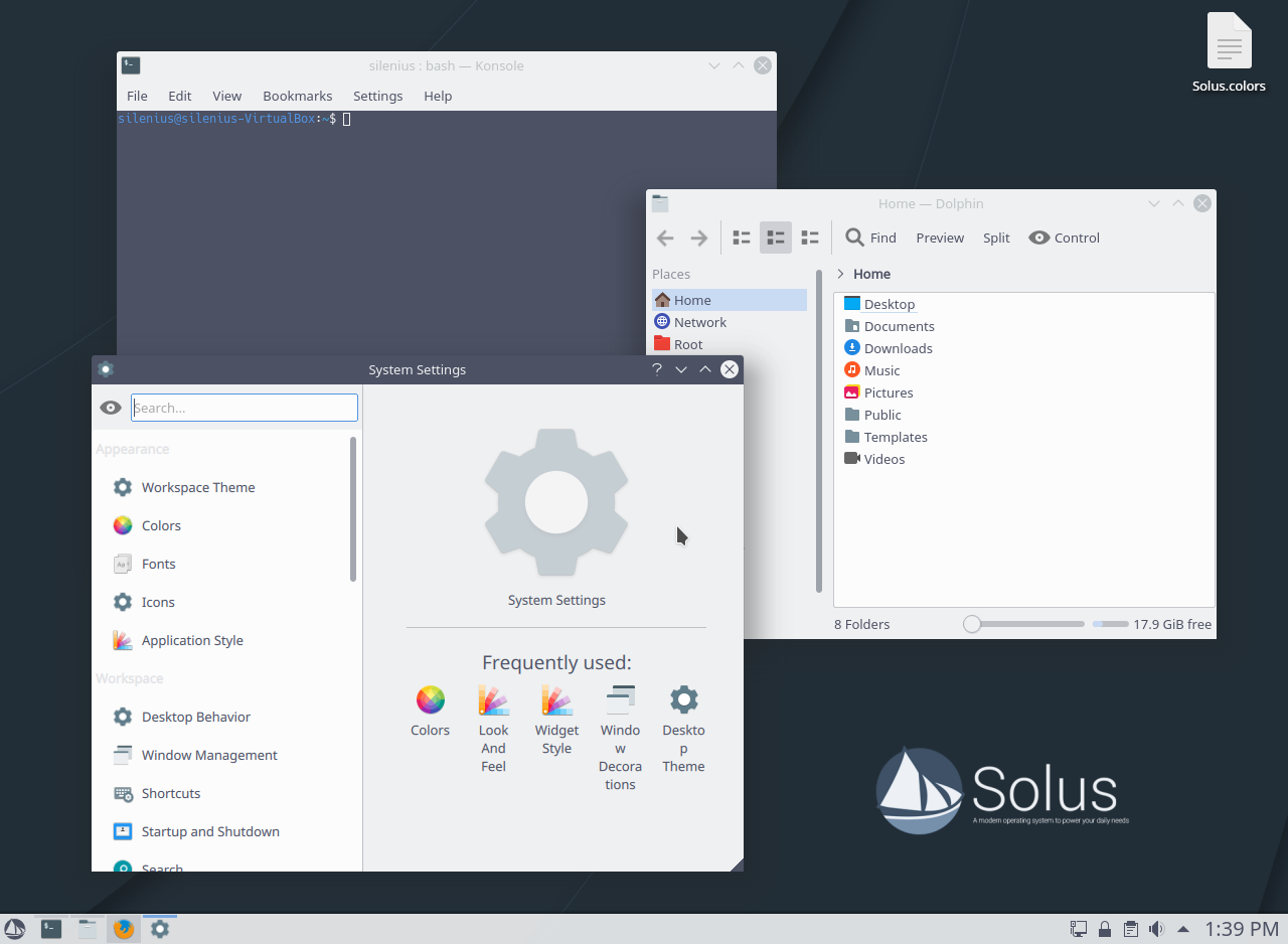
Solus Plasma defaults

Izaic I know what they doing, and I try to believe they stole some of our ideas we had 
9 months later
I was working a bit again on the theme, I added a light theme as well so anyone up for testing? after you done testing you need to run
sudo eopkg it --reinstall plasma-desktop-branding
- Edited

Theme/style/colours
Budgie's default theming is amazing! SolusDark is on the right track.
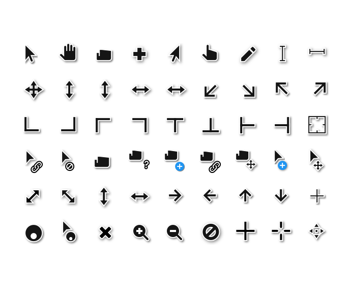
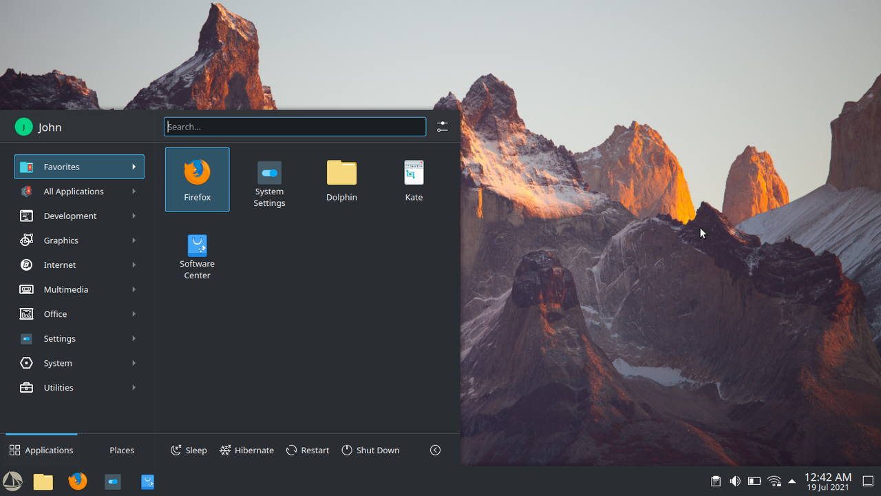
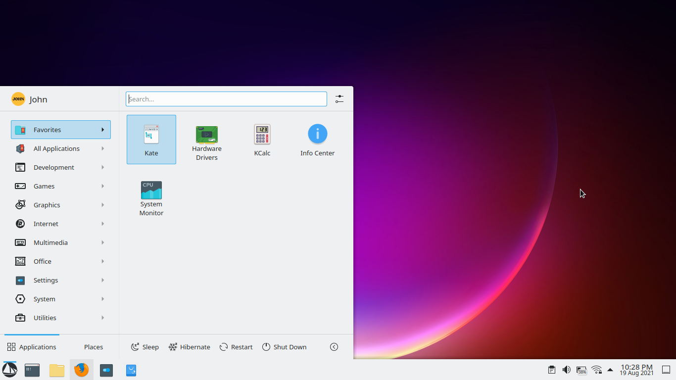
Application Launcher/Start Icon
Like many here I think the normal Solus logo as the start icon looks tacky. BUT when the colours are changed to better compliment dark/light themes, it looks beautiful! Examples....
Dark Theme
Light Theme
Start Icons Available Here
Original Post/Source
Cursors
I really like the idea of seeing the following
Dark Theme
We10XOS Cursors

Light Theme
Hopefully We10XOS Dark Cursors become a thing to keep theming coherent. If not I'd fall back to Adwaita cursors or
Paper Cursors
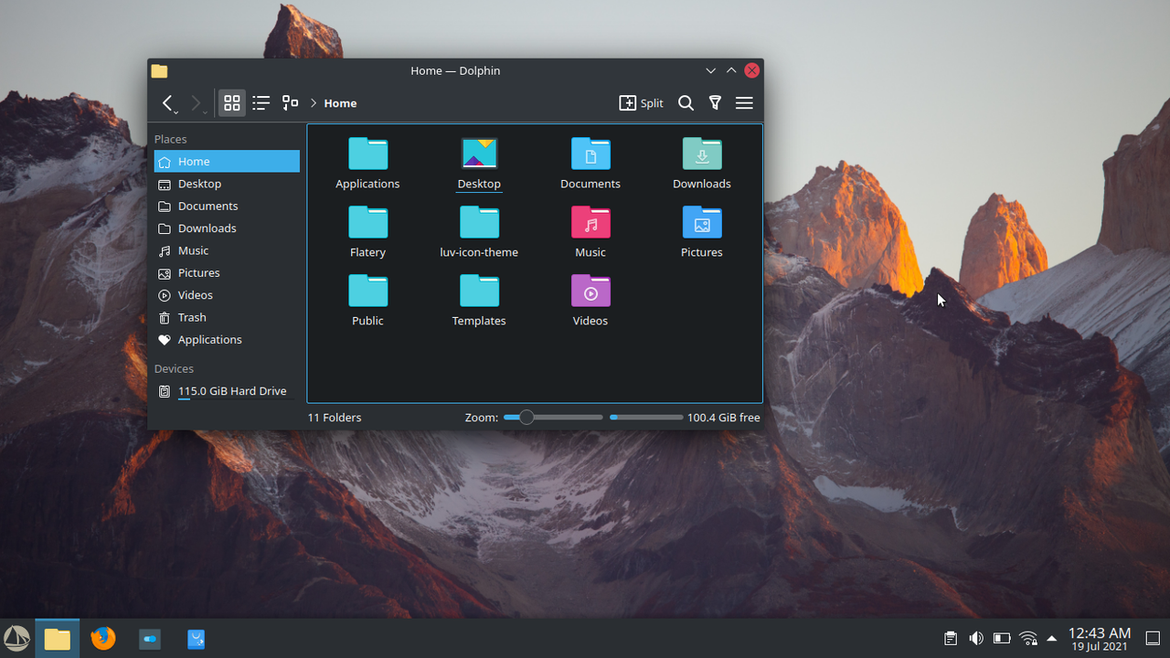
Icons
Personally I love paper-esque icon sets and I think they look great on Solus Plasma.
Paper Icon Set
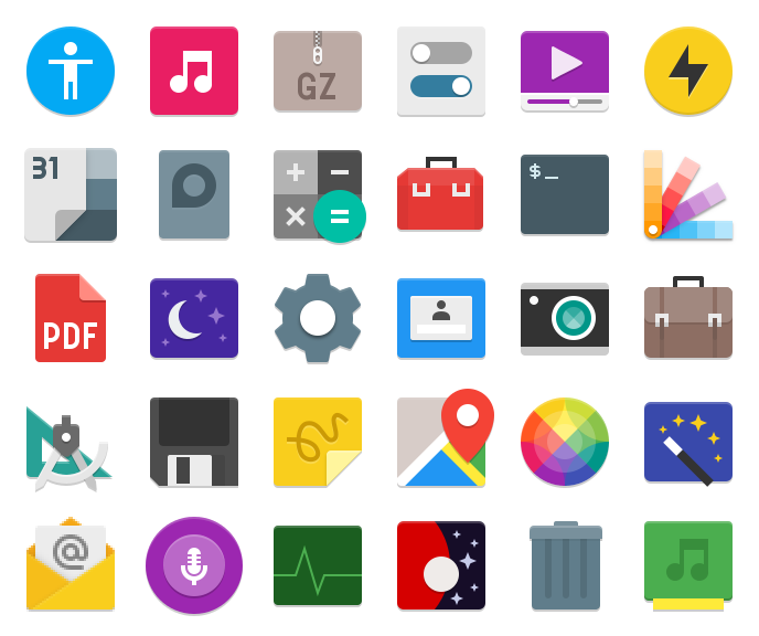
I currently use Lüv icon theme. For me this icon set is my personal favourite.
Lüv Icon Theme
Screenshot
Honorable Mentions
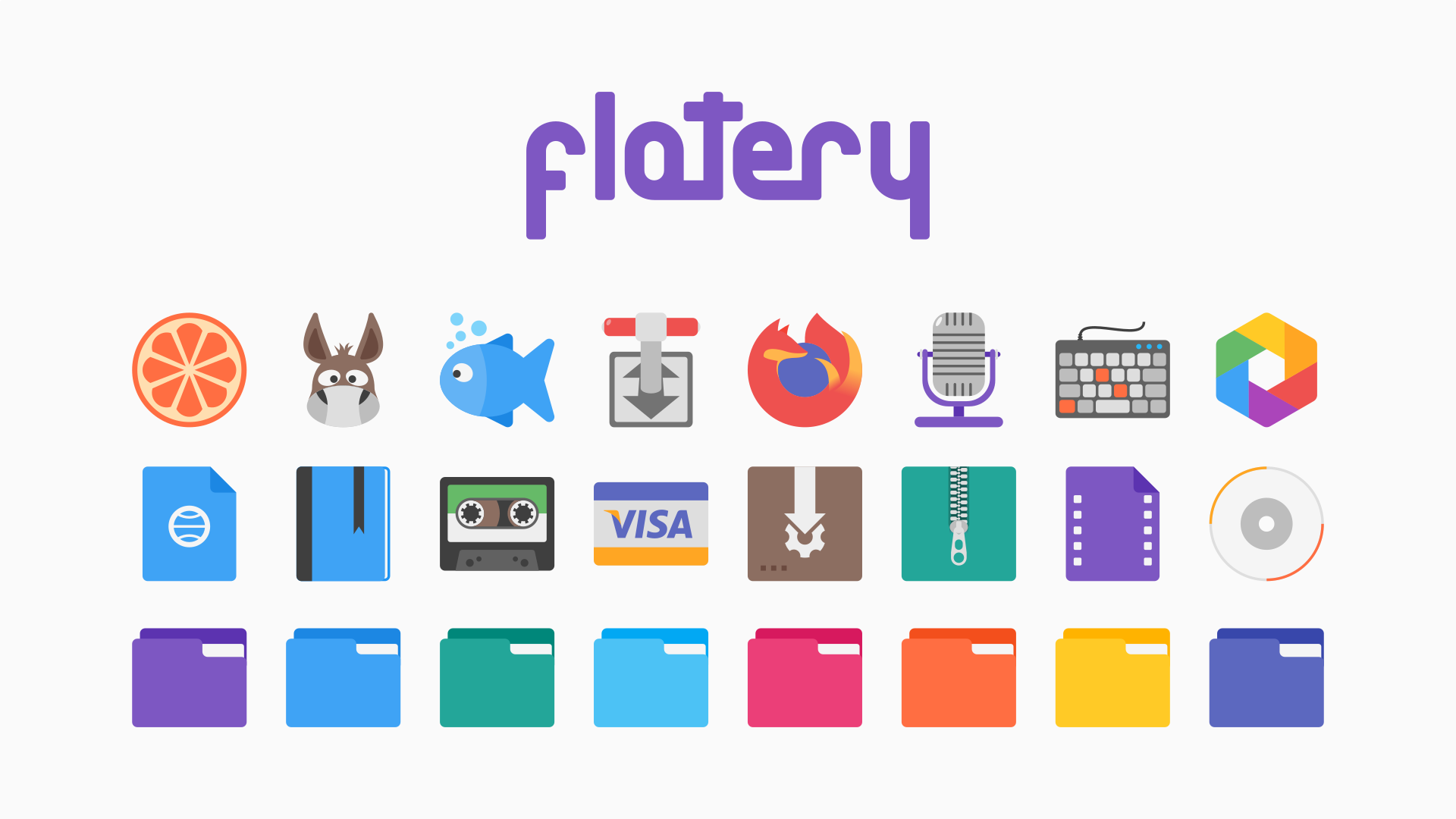
Flatery Icon Theme
Qogir Icon Theme
Side note
It's interesting that there was a Solus Icon Set once upon a time
Solus Icon Set
Fonts
I haven't looked into fonts tbh....
Application selection
No issues here.
Final Thoughts
Just some ideas, regardless if any are implemented or not it doesn't bother me.
Imma continue supporting Solus/Solus Plasma
xjdwc Side note
It's interesting that there was a Solus Icon Set once upon a time
Solus Icon Set
Interesting, I liked them a lot. Sensible, not cutesy. From your link: "Solus-icon-theme forked from solus-project/solus-icon-theme...Solus is the official icon set of the Solus Project. As a FreeDesktop icon theme it (loosely) follows the Tango Icon Spec....."
...I did not know we had an official icon set to fork.
- Edited
brent It was something we had paid Sam Hewitt for a long time ago (like years) but he suddenly stopped working on it and never came back to completing it.
Not really interested in a dedicated icon theme at this moment though. I am pretty happy with Papirus. Only thing that is on the long list of stuff I want to get around to is a Budgie+GTK specific theme.
JoshStrobl Someday when they write the history of the Solus distro, it will be full of the gems like the Hewitt contribution. Love it.
13 days later
- Edited
Thoughts and Ideas
So, after I updated my laptop to Solus 4.3, I noticed the theming for Plasma changed quite a bit. I feel like the theming for Solus was going in the right direction with SolusDark prior to the update. Then BOOM! I don't know how to explain it, Plasma just seems very fragmented when it comes to the theming side of things. Not as solid and cohesive as Solus Budgie out of the box. I believe Solus Plasma should be distinct from Budgie's theming and have it's own personality, but still be cohesive in terms of aesthetic. Allowing our at first sight impressions to group both Solus Plasma & Budgie as members of the same Family rather than complete strangers.
I would still challenge the theming even if it was the only DE available. Plasma just seems like an Experiment/WIP in the theming department.
I personally believe sticking with Opaque theming is the way to go. Transparency/translucency seems out of place for the default. Sticking with darker colour schemes is a yes, not as dark as budgie though. Solus Plasma needs it's own identity. So I don't really have much else to add. See my above post for my detailed ideas.
Plasma out of place?

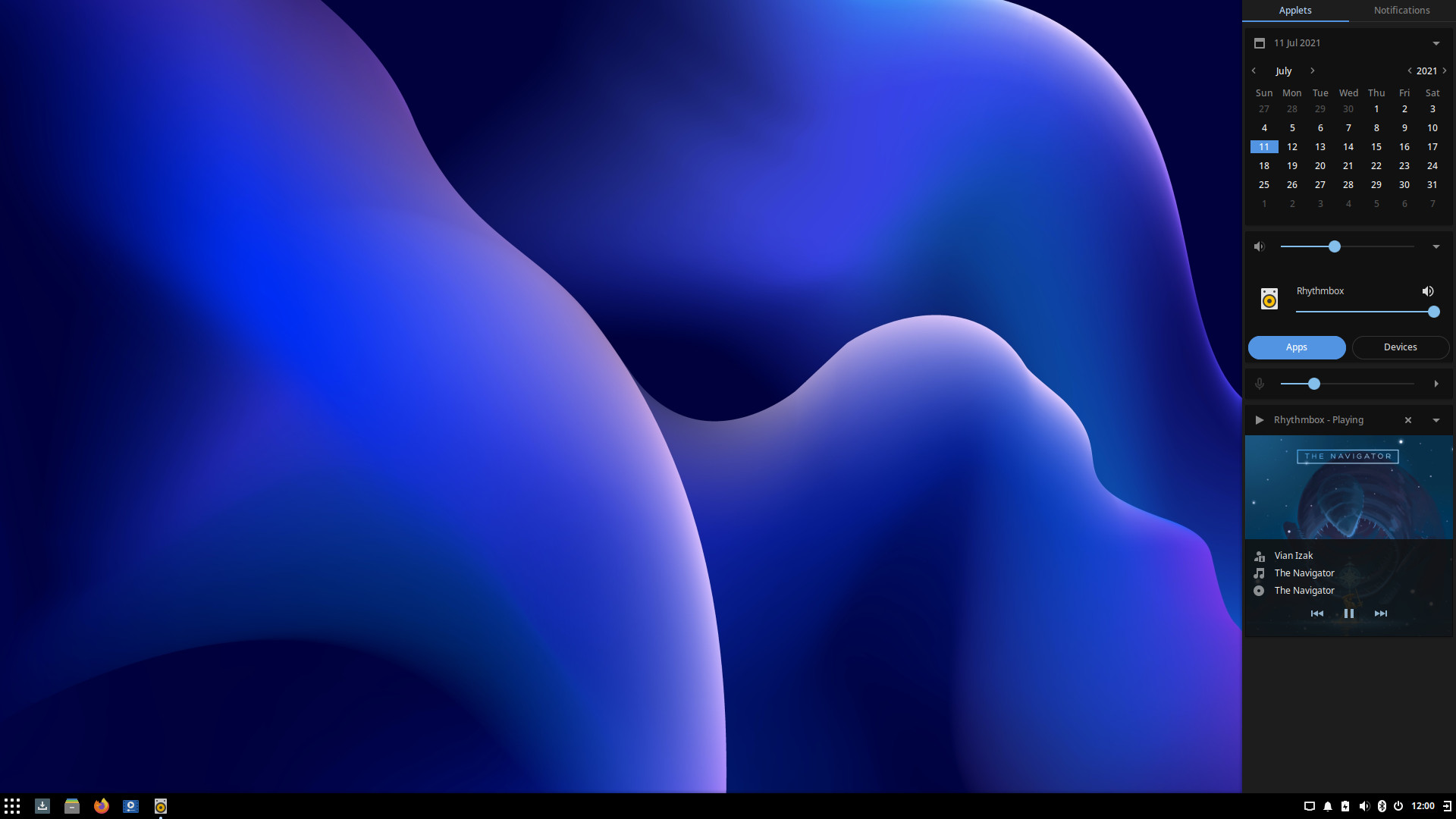
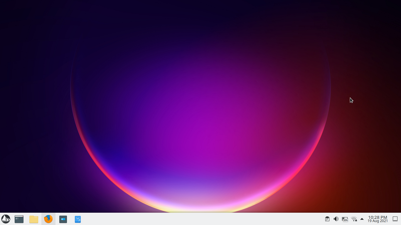
My Default Plasma Theming
Final Thoughts
Like my first post, just some ideas, regardless if any are implemented or not it doesn't bother me.
Imma continue supporting Solus/Solus Plasma
I would love to hear everyone's thoughts on this topic.
Thank you @Girtablulu for all your hard work!

Theming is such a matter of personal preference. I actually think the plasma theming with all the transparency looks much nicer than the other desktop options but that is just my preference.
I also don't see any reason for all versions to have the same theming when the underlying technology that supports them is so different. The reality is that plasma is simply different than all the other gtk-based options.
Fair points indeed. Theming is very subjective. We won't be able to please everyone with theming, but I believe a solid base to work from should still be strived for. In the end we all tinker and tweak our systems to fit our personal work flow and eye.
As for the reality of differences, I agree. Differences should be celebrated and not suppressed type thing. Do you think it's possible to do so in way that still maintains a somewhat aesthetic consistency across Solus? Or don't try to at all? Probably just my personal preference....
Thank you for your thoughts
xjdwc Do you think it's possible to do so in way that still maintains a somewhat aesthetic consistency across Solus? Or don't try to at all?
To me this is a philosophical question more than a practical one. I personally don't think that there is any need or value in that consistency. In fact, I think it detracts from the plasma experience to make it look like you prefer it. To me, you made it look more gtk-like. Personally, I don't want my system to look like that. Someone else will probably disagree because we all like different things.
Ultimately, I think it comes down to what the Solus team wants. Do they want a unified look and feel or do they not feel it is important. 
You're right! I didn't really think about what I was saying. Instead of, "is it possible", which we know it is. Plasma is highly customizable. I should have asked, "do we want to" or "should we".
Your points are very valid and even render my own comments obsolete. As you've said, in the end, whatever direction the Solus Team wants to go will be the final result.
@xjdwc I tried once trurning the theme into a plata like coloring but looked hella ugly
a month later
- Edited
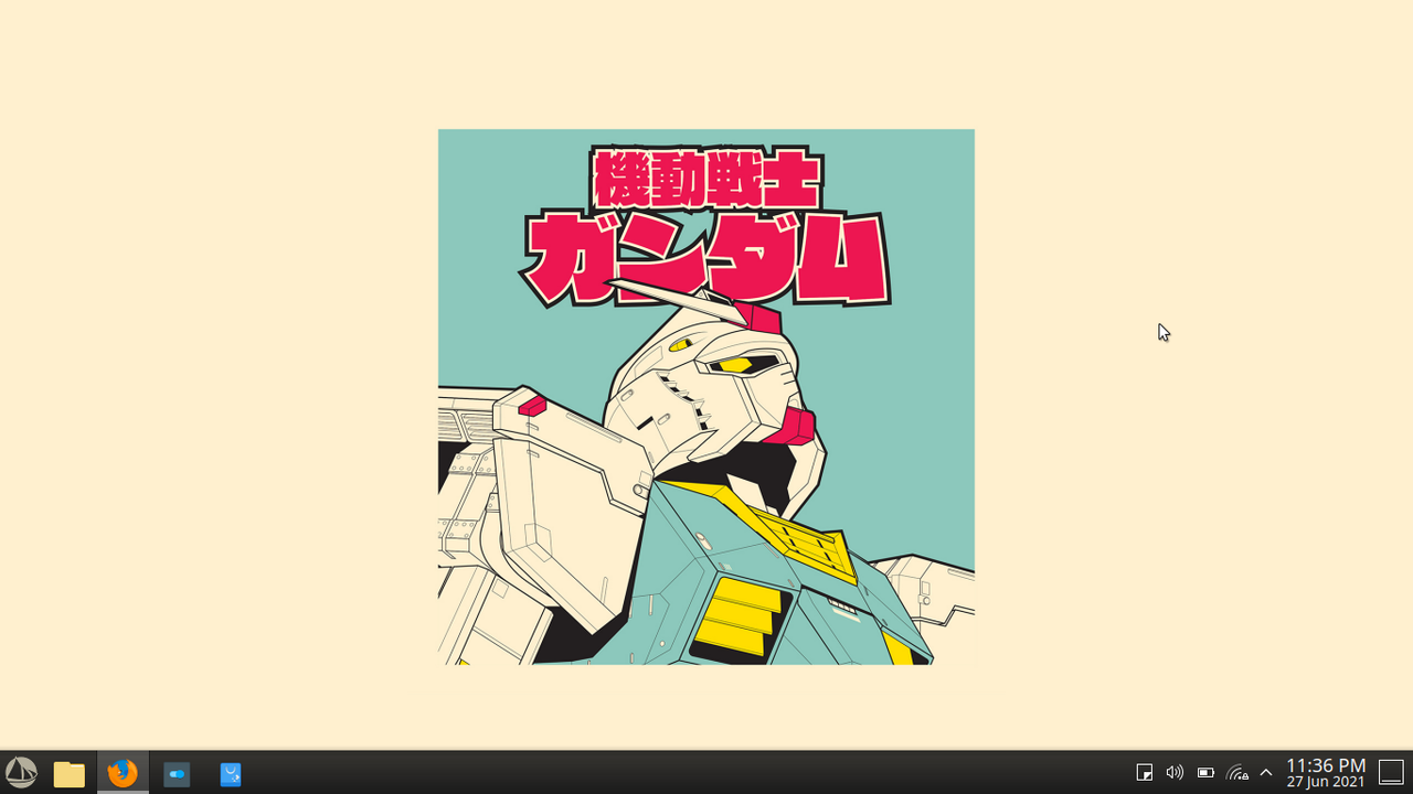
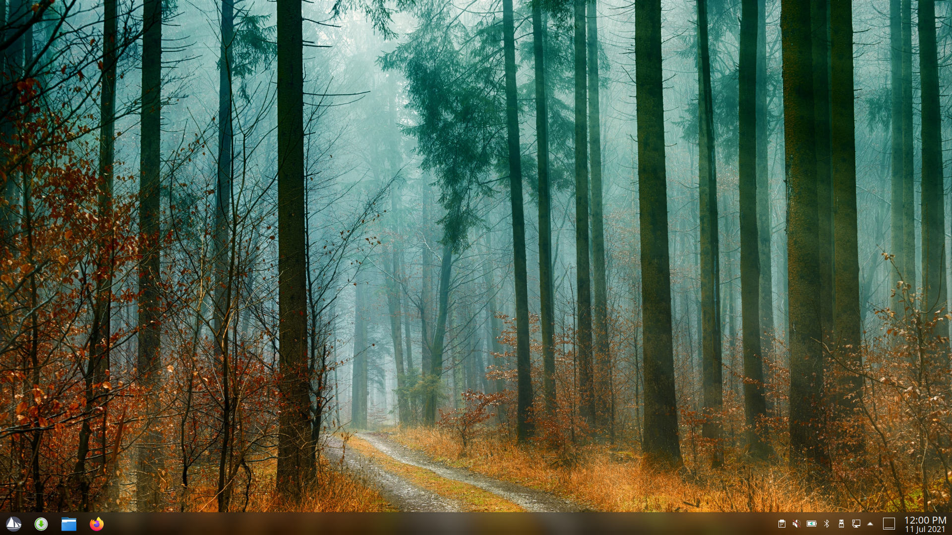
Plasma Light Theme
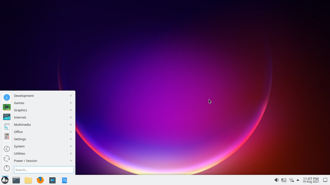
Alternative Menu
My Inspiration
I am usually a dark theme type of guy, but atm, I'm really digging the light theme on Plasma.
What are your thoughts?
16 days later
I tried Solus Plasma today to see how it looks like and I must say that it looks great. And if someone wants to go crazy with the looks options are there. The adaptive panel transparency works great and if you make a top panel with global menu it works fine. Whoever tweaks the defaults knows what's good. If someone likes KDE, Solus Plasma is a great choice.
24 days later
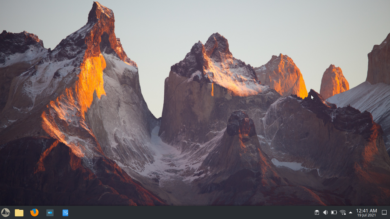
BTW what's your fav panel high?
[deleted]
Girtablulu
The current default (46) is just fine.

Girtablulu I'm using 37 because of the smaller screen I have.