Theme/style/colours
Budgie's default theming is amazing! SolusDark is on the right track.
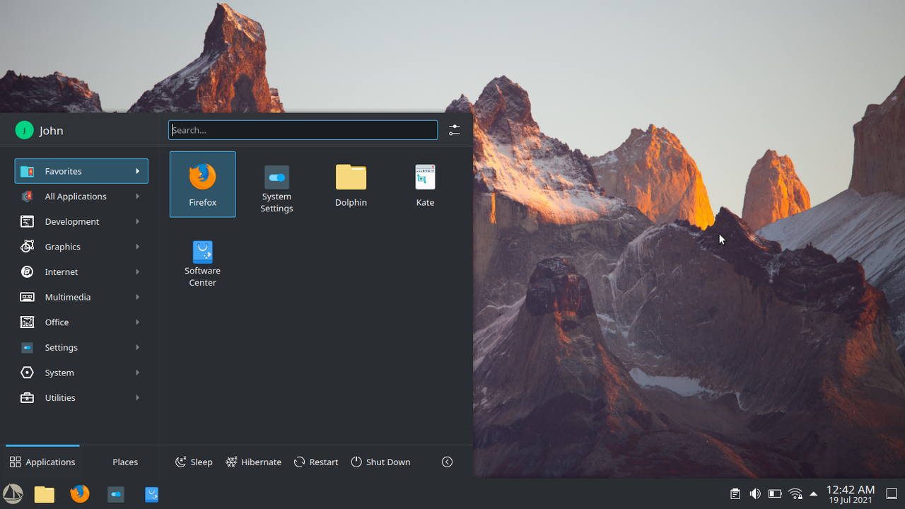
Application Launcher/Start Icon
Like many here I think the normal Solus logo as the start icon looks tacky. BUT when the colours are changed to better compliment dark/light themes, it looks beautiful! Examples....
Dark Theme
https://i.imgur.com/DAL92P4.png
Light Theme
https://i.imgur.com/sgEIgFM.png
Start Icons Available Here
Original Post/Source
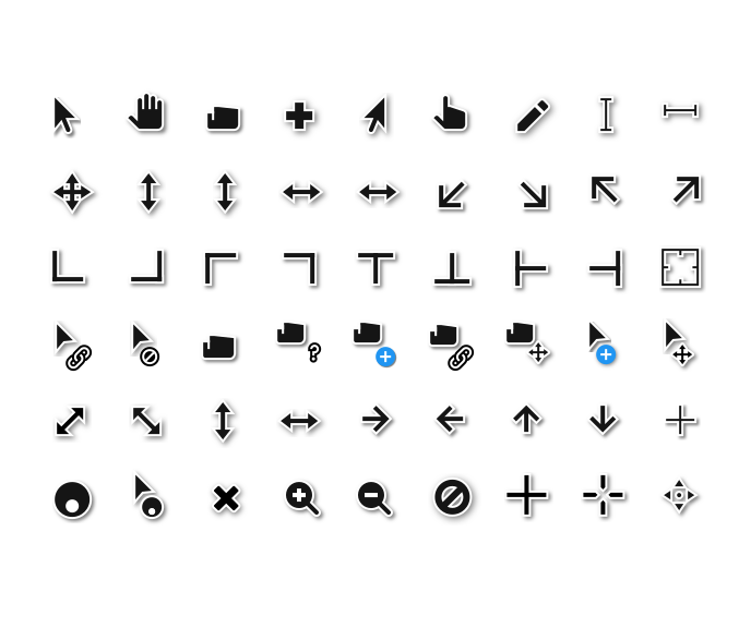
Cursors
I really like the idea of seeing the following
Dark Theme
We10XOS Cursors

Light Theme
Hopefully We10XOS Dark Cursors become a thing to keep theming coherent. If not I'd fall back to Adwaita cursors or
Paper Cursors
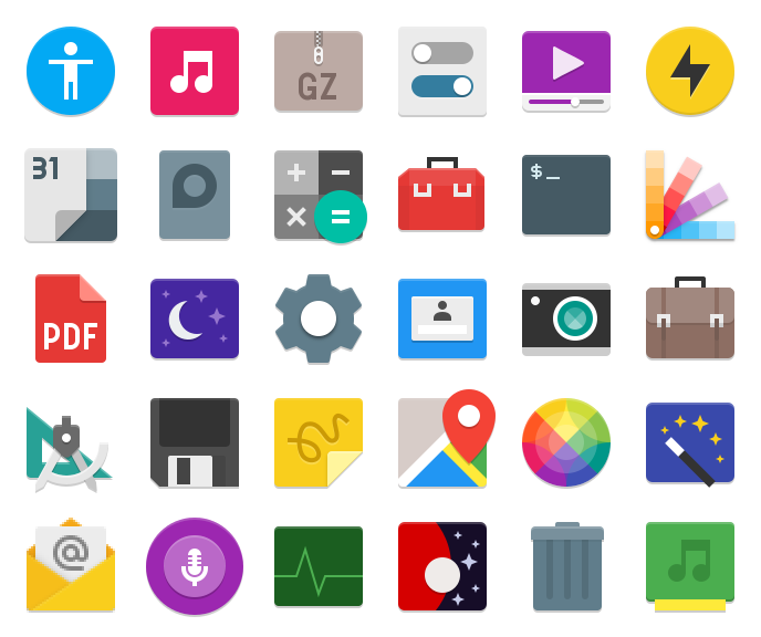
Icons
Personally I love paper-esque icon sets and I think they look great on Solus Plasma.
Paper Icon Set
Link
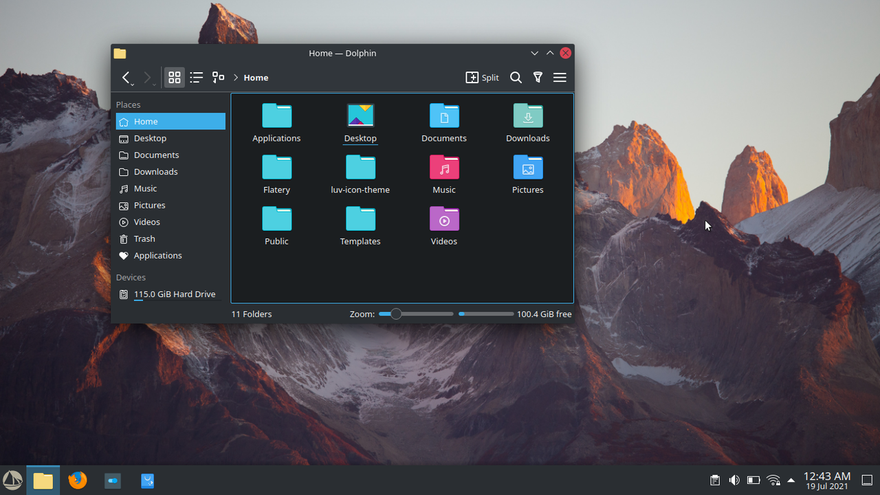
I currently use Lüv icon theme. For me this icon set is my personal favourite.
Lüv Icon Theme

Link
Screenshot
Honorable Mentions
Flatery Icon Theme
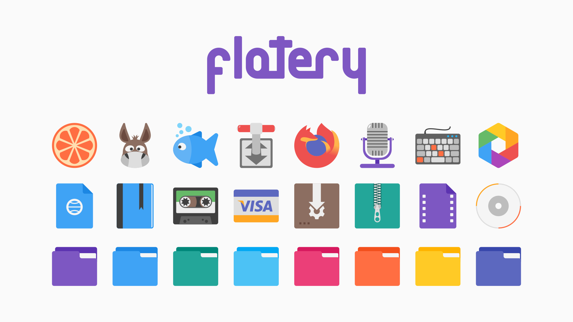
Link
Qogir Icon Theme
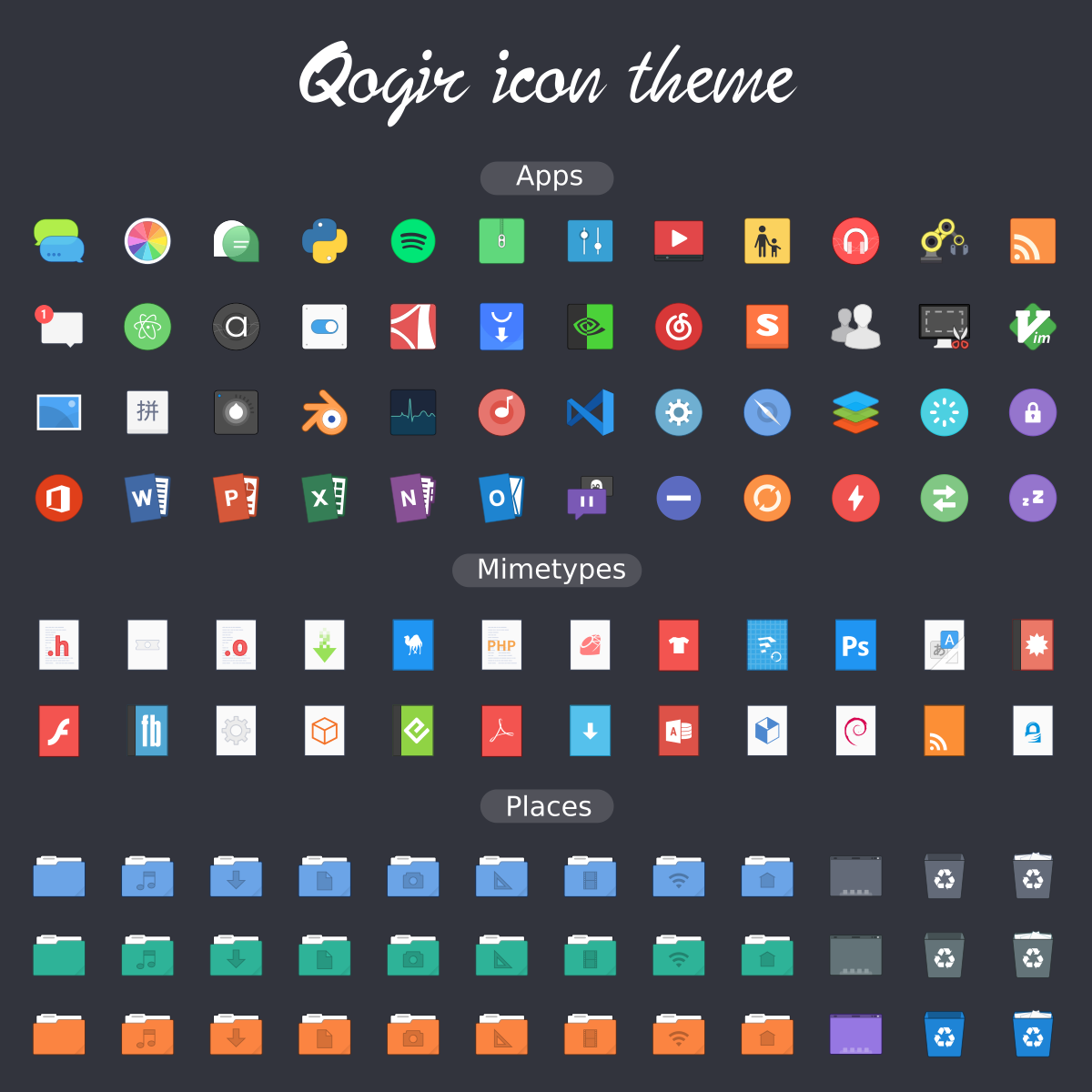
Link
Side note
It's interesting that there was a Solus Icon Set once upon a time
Solus Icon Set
Link
Fonts
I haven't looked into fonts tbh....
Application selection
No issues here.
Final Thoughts
Just some ideas, regardless if any are implemented or not it doesn't bother me.
Imma continue supporting Solus/Solus Plasma 🙂