Thoughts and Ideas

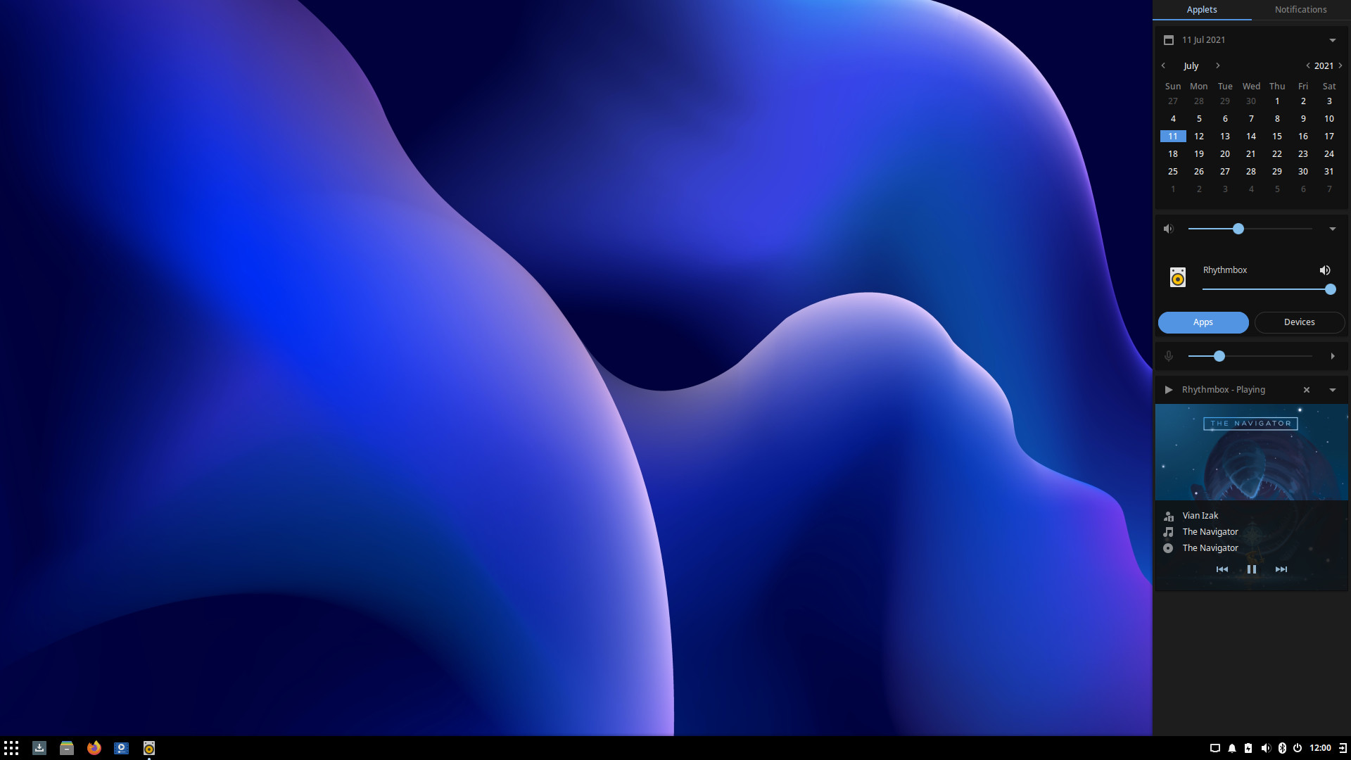
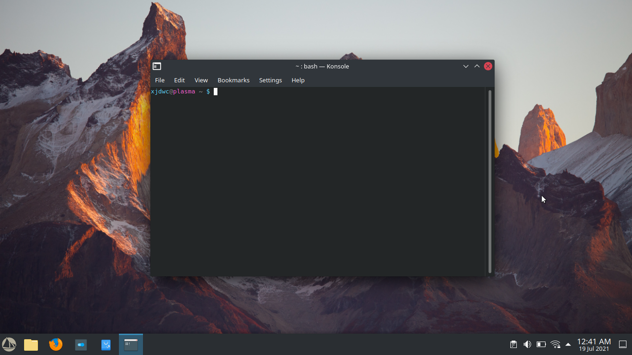
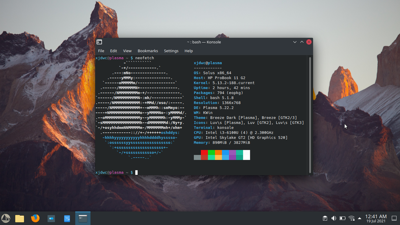
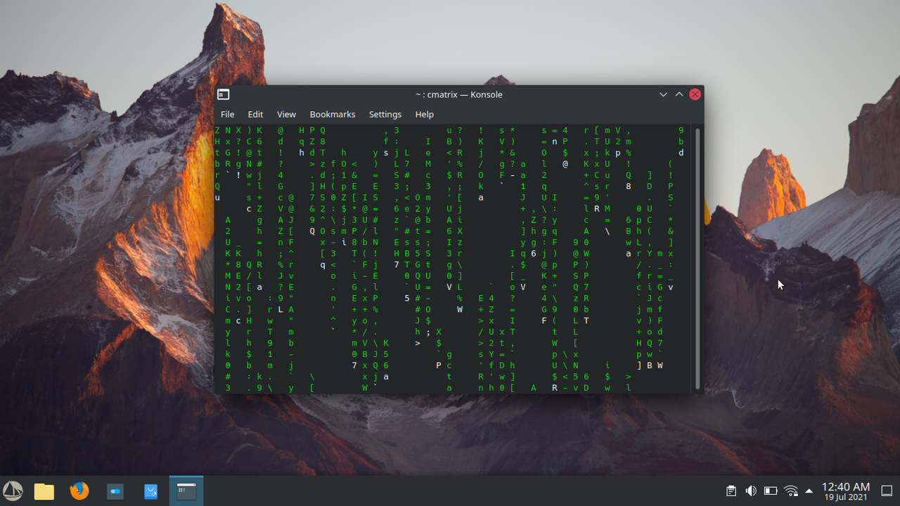
So, after I updated my laptop to Solus 4.3, I noticed the theming for Plasma changed quite a bit. I feel like the theming for Solus was going in the right direction with SolusDark prior to the update. Then BOOM! I don't know how to explain it, Plasma just seems very fragmented when it comes to the theming side of things. Not as solid and cohesive as Solus Budgie out of the box. I believe Solus Plasma should be distinct from Budgie's theming and have it's own personality, but still be cohesive in terms of aesthetic. Allowing our at first sight impressions to group both Solus Plasma & Budgie as members of the same Family rather than complete strangers.

I would still challenge the theming even if it was the only DE available. Plasma just seems like an Experiment/WIP in the theming department.

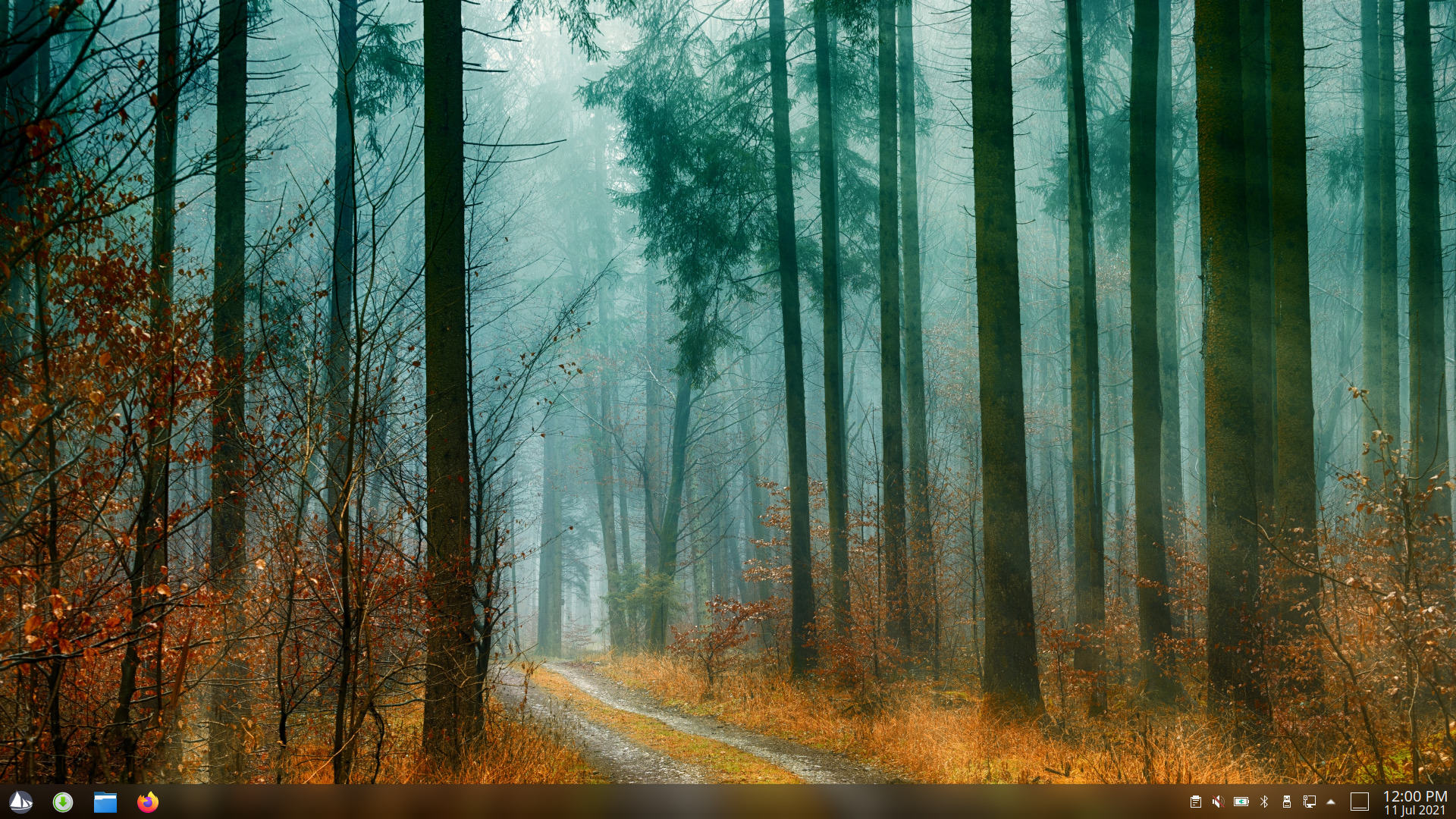
I personally believe sticking with Opaque theming is the way to go. Transparency/translucency seems out of place for the default. Sticking with darker colour schemes is a yes, not as dark as budgie though. Solus Plasma needs it's own identity. So I don't really have much else to add. See my above post for my detailed ideas.

Plasma out of place?


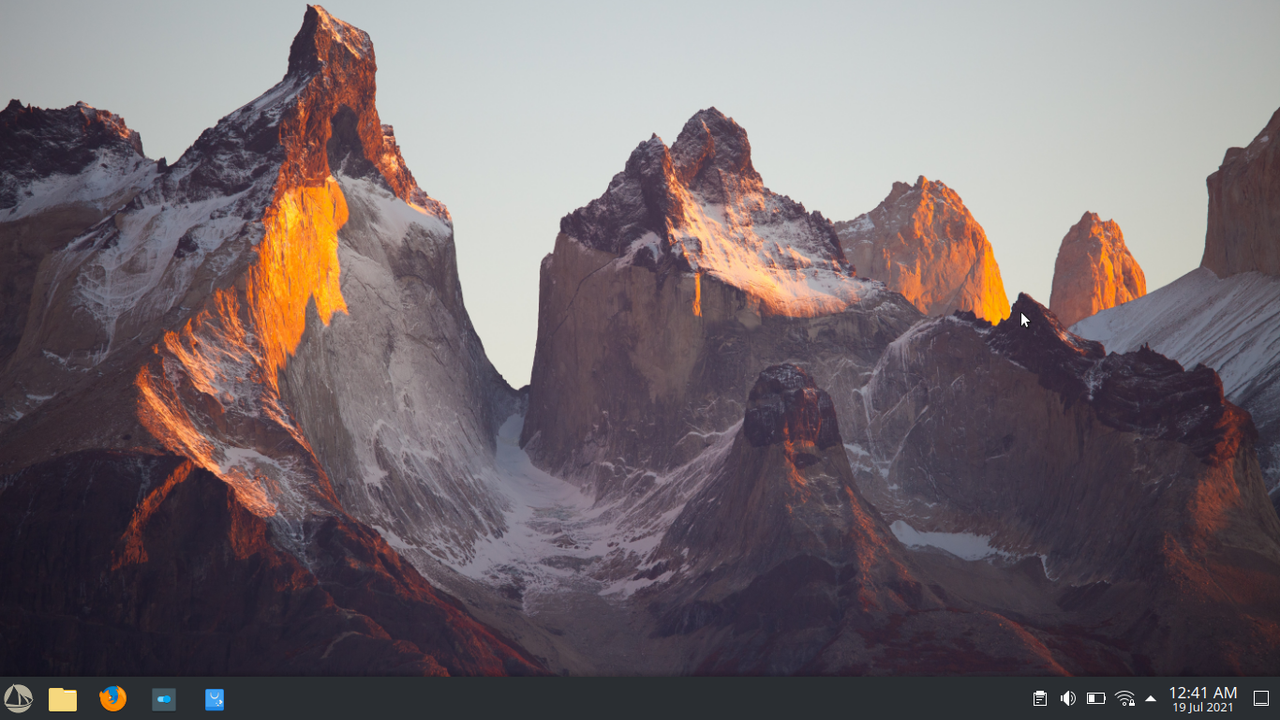
My Default Plasma Theming


Final Thoughts

Like my first post, just some ideas, regardless if any are implemented or not it doesn't bother me.
Imma continue supporting Solus/Solus Plasma πŸ™‚

I would love to hear everyone's thoughts on this topic.

Thank you @Girtablulu for all your hard work!

    xjdwc

    Theming is such a matter of personal preference. I actually think the plasma theming with all the transparency looks much nicer than the other desktop options but that is just my preference.

    I also don't see any reason for all versions to have the same theming when the underlying technology that supports them is so different. The reality is that plasma is simply different than all the other gtk-based options.

      dalto

      Fair points indeed. Theming is very subjective. We won't be able to please everyone with theming, but I believe a solid base to work from should still be strived for. In the end we all tinker and tweak our systems to fit our personal work flow and eye.

      As for the reality of differences, I agree. Differences should be celebrated and not suppressed type thing. Do you think it's possible to do so in way that still maintains a somewhat aesthetic consistency across Solus? Or don't try to at all? Probably just my personal preference....

      Thank you for your thoughts πŸ™‚

        xjdwc Do you think it's possible to do so in way that still maintains a somewhat aesthetic consistency across Solus? Or don't try to at all?

        To me this is a philosophical question more than a practical one. I personally don't think that there is any need or value in that consistency. In fact, I think it detracts from the plasma experience to make it look like you prefer it. To me, you made it look more gtk-like. Personally, I don't want my system to look like that. Someone else will probably disagree because we all like different things.

        Ultimately, I think it comes down to what the Solus team wants. Do they want a unified look and feel or do they not feel it is important. πŸ€·β€β™‚οΈ

        You're right! I didn't really think about what I was saying. Instead of, "is it possible", which we know it is. Plasma is highly customizable. I should have asked, "do we want to" or "should we".

        Your points are very valid and even render my own comments obsolete. As you've said, in the end, whatever direction the Solus Team wants to go will be the final result.

        a month later

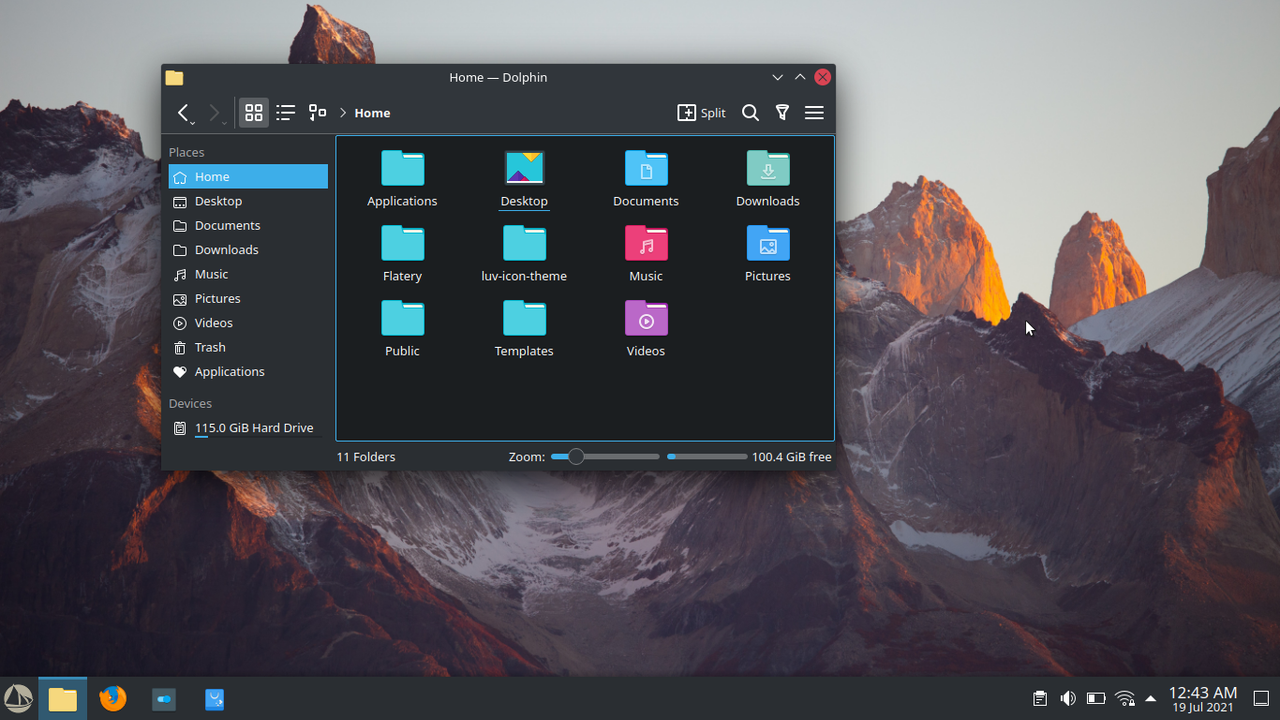
        Plasma Light Theme


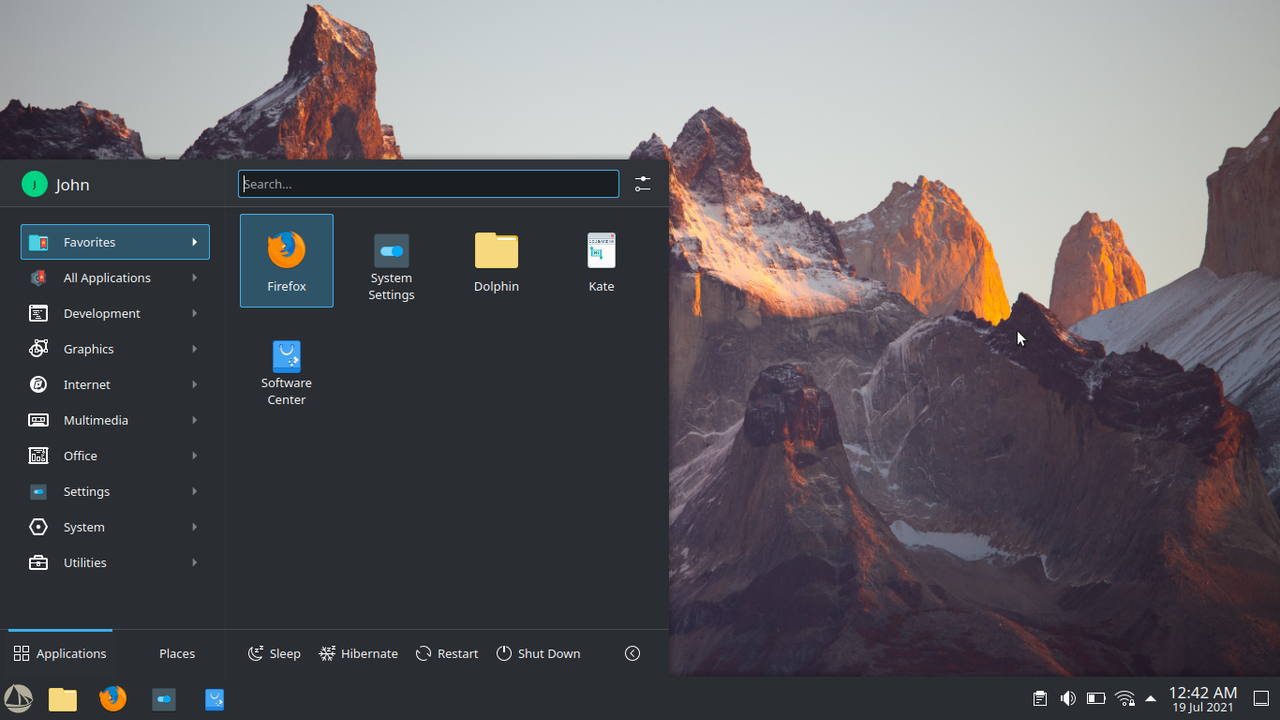
        Alternative Menu


        My Inspiration


        I am usually a dark theme type of guy, but atm, I'm really digging the light theme on Plasma.
        What are your thoughts?

          MarkoB

          Global Theme: Breeze
          Application Style: Breeze
          Plasma Style: Breeze
          Colors: Breeze
          Window Decorations: Breeze
          Icons: LΓΌv
          Cursors: Adwaita
          Panel Settings - Opacity: Opaque
          Application Menu Icon: Custom Solus Icon

          16 days later

          I tried Solus Plasma today to see how it looks like and I must say that it looks great. And if someone wants to go crazy with the looks options are there. The adaptive panel transparency works great and if you make a top panel with global menu it works fine. Whoever tweaks the defaults knows what's good. If someone likes KDE, Solus Plasma is a great choice.

          24 days later
          • [deleted]

          Girtablulu
          The current default (46) is just fine.

          36 is what I have it set to. To me the current default panel height is ridiculously large, pinned icons are massive and at 36 it looked much better to me while keeping the clock displaying time + date without looking weird.

            I use 2560x1080 ultrawide monitor, and the size 46 is very nice for me

            Did not think about how higher resolutions would change peoples opinion. I'm using 1920x1080.

            https://store.steampowered.com/hwsurvey
            68.42% 1920 x 1080
            9.27% 2560 x 1440
            7.04% 1366 x 768
            1.99% 3840 x 2160
            1.02% 3440 x 1440

            Not suggesting that this means the default has to decrease. Maybe 46 is a good default because it remains usable at higher resolutions? πŸ€·β€β™‚οΈ While I hate the default for my resolution, its trivial to change it so no big deal.