6 days later

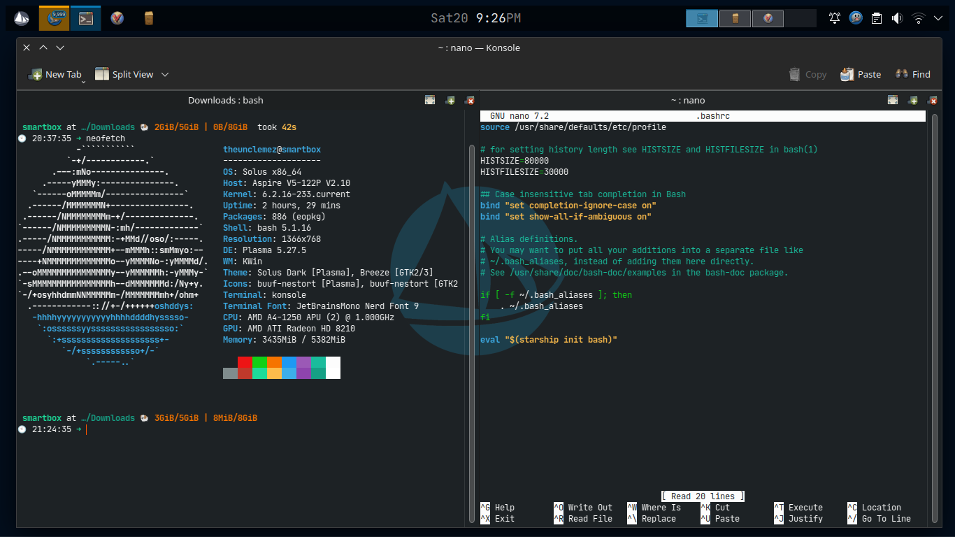
Experimenting a bit of too much I can find on Plasma, decided to look at a look i've not considered yet.
is this too much or just okay ?

    @Solarmass
    I've been looking around and found that the cursor "Future" do have a cyan color version and it should be okay with Solus Plasma ... just don't know if Future is also available for GTK or not ....

      unclemez is this too much or just okay ?

      Not sure what you're asking. Just okay or too much of what?

        WetGeek
        I mean does it look correct, ugly or too much !
        the Look only look (icons etc.)

          @Staudey as a matter of style in Solus, how can I request for a change in Solus Look and Feel (plasma in this case) ?

          I mean, I've found that the font "JetBrains Mono" to be lekker/good and more consistent for terminal users/usage and Devs task too, it could be a very good replacement to the font "Hack" which is not bad but the jetbrains font is professionally made and look more consistent in many ways.
          Look at below screenshots
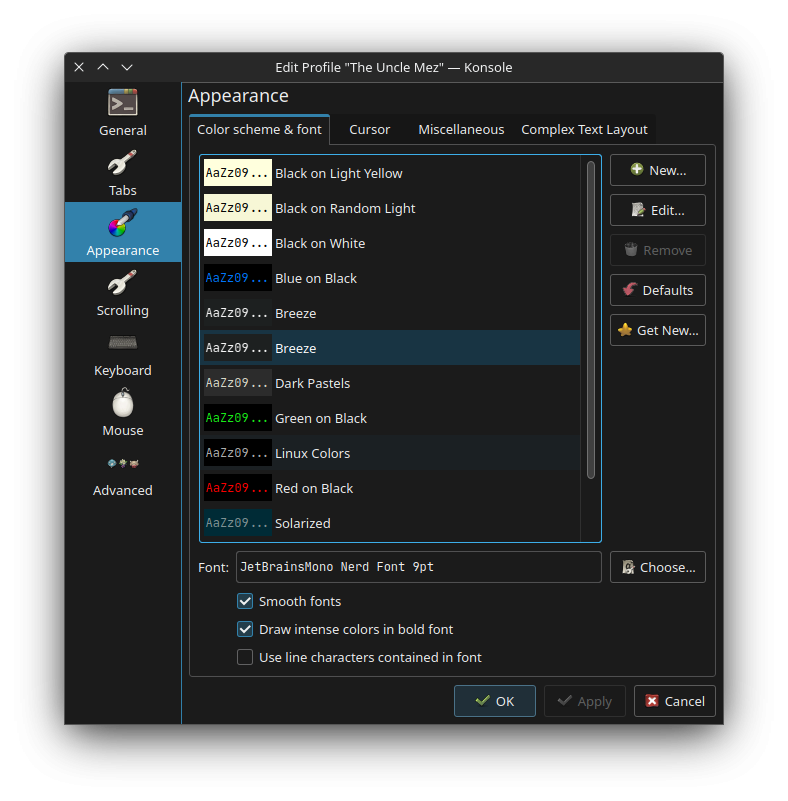
            unclemez I mean does it look correct, ugly or too much !

            The icons look fine to me. I don't think they're too much. I particularly like the looks of the Future-cyan cursor set.

              WetGeek me too, I love the Future cyan, it matches with the Solus colours, even if Solus is more on the blue than the pure Cyan in cursor theme

              unclemez

              I see that they are very similar to bibata, but bibata has those colorful corner resizing things I like the best! 🙂
              Oh, and btw I am using Budgie.

                Now experimenting with a Much cool and conform theme called Fantasy Blue-Dark
                To me, this one matches with Solus color ... and folders and other icons are just okay
                so Fantasy Blue-Dark + Future Cyan is just ... Correct.

                  Look how cool and beautiful is the software center icon, I Love this ...

                  Solarmass Yes but it is lacking of the pure Blue and Cyan of Future is close to the Solus Blue

                  unclemez I like it and did not know it was in repo. thanks

                  as for the rest its visually impressive, and I especially respect the celebration of yourself (hey someone has to do it!) in the homemade wallpaper.
                  You have a good eye. The fantasy icons cool too especially in that last pic. At the end of the day, however, I'm a List View guy for everything. I really need to see accessed dates/item counts/size/type etc everytime I open a file manager.

                    brent especially respect the celebration of yourself (hey someone has to do it!) in the homemade wallpaper.

                    Oh yeah, that one is almost 2 years old !
                    I do have a blue varient of it ... thank you, will go for the blue version ... hehehe!

                    unclemez as a matter of style in Solus, how can I request for a change in Solus Look and Feel (plasma in this case) ?

                    Probably best to create a task on our dev tracker if you have concrete suggestions for improvements.


                    With the recent update 🙂 it's so greeeeeeeeeeat !!!