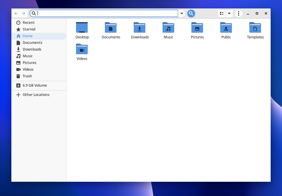
I love Solus OS to bits, but the title bar remains my pet peeve. The reason is exactly what gorzka demonstrates; something I would describe as a title bar with a mind of its own. The biggest eye sore being the menu icon with three vertical dots. I find it stands out too much as the title bar seems to have padding of about 10 pixels, where the menu icon then extends beyond that, visually appearing larger than the others. It then has a round shadow around it, while other icons have square shadows around them. The other pet peeve being that this icon appears in different places for different applications.
That being said, I am a 'surface' user, one who is attracted to uniformity and UI design but one who does not have any technical skills to do anything about it himself. So my opinion may not hold ground for those who dedicate valuable hours to Solus. It is however, something I have noticed about the UI and believe it will be worth having a closer look at.
