
Maybe I'm the only one, but I'm missing a light "SolusLight" theme. Therefore I switched to Breeze for that.
Solus Plasma defaults
Why didn't vlc set the default media player in the plasma version?

alexis0071
I want to have as less gtk stuff as possible on the iso and mpv player is a great player as well
Girtablulu
Thank you very much for your response, I think there is a vlc version for qt, if I remember correctly, I want to thank you, install solus kde and it is excellent
- Edited

perstreperous FiraSans Book is a very good font https://github.com/bBoxType/FiraSans
This font is used in Pop OS
I wanted to report that when I went to install solus plasma, I could never put the installer in Spanish I had to continue with the English and Google translator to see what it said

alexis0071 The Installer is in English, the language selection is for the installed system.
I thought that by putting the language in Spanish, the whole installation process in Spanish begins that would be easier for Spanish speakers and much better for people who are starting
JoshStrobl
haaaa and thanks for your answers and for the time you use for us

Could you set the GTK theme to the same Budgie/Gnome currently uses (Plata)? I think it is better looking but most importantly much more readable than Breeze dark. Also I think this is the direction QT theme should be going, currently those tones seem bland and not readable enough.
I just moved to Budgie after a year of Plasma, and I think Plasma is a fantastic edition, but Budgie is themed nicer.

JacekJagosz The plata maintainer hates QT, and wont make a Kvantum (A theme engine for QT that makes it easier to create individual themes) or QT theme for Plasma. That said, feel free to try making a Kvantum theme for it. That's why the Plasma desktop in Solus just uses a color scheme.

jgs How can I go about doing that? I like it better than the plasma logo. 
First of all thanks Girtablulu for asking users their inconveniences and needs.
Following are few changes which I make after every KDE install.
1) In a dark theme, black shadows for windows totally defy the purpose of shadows, instead white/light glow is essential as shown in screenshots below. This I see overlooked at almost all places/distros I tested till now with default dark theme.
2) Double click title bar to maximize vertically ( at system settings > window behavior > titlebar actions).
3) There are multiple options pre-configured in KDE to maximize the windows, the most annoying is ‘windows dragged to top of screen edge’, which I deselect at workspace behavior > screen edges.
4) Middle click to shade ( at system settings > window behavior > titlebar actions).
5) Window decorator Breez is OK, but KDE means maximum freedom for configuration. So availability of window decorator ‘oxygen’ in default installation will help the new users to explore KDE.
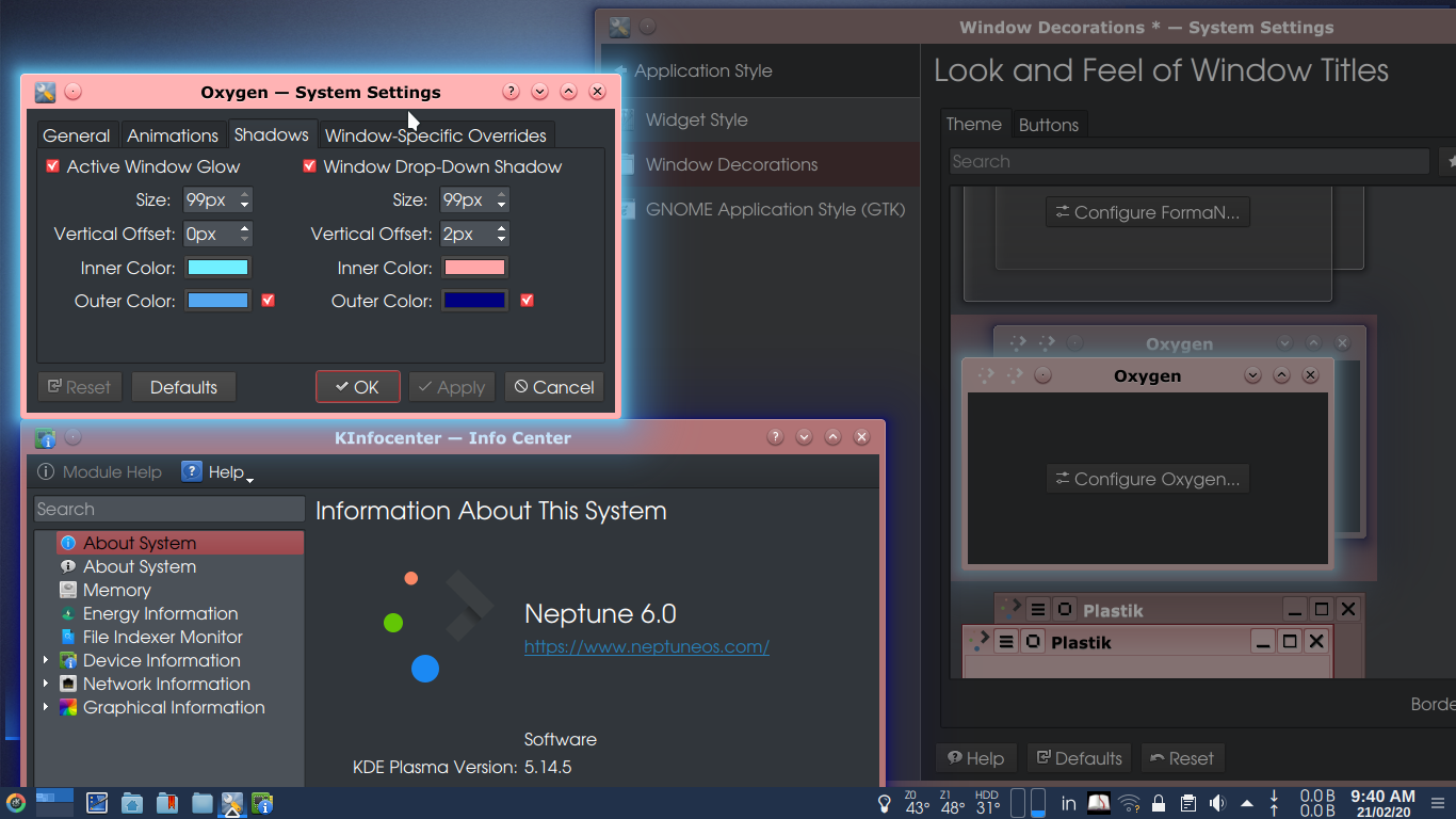
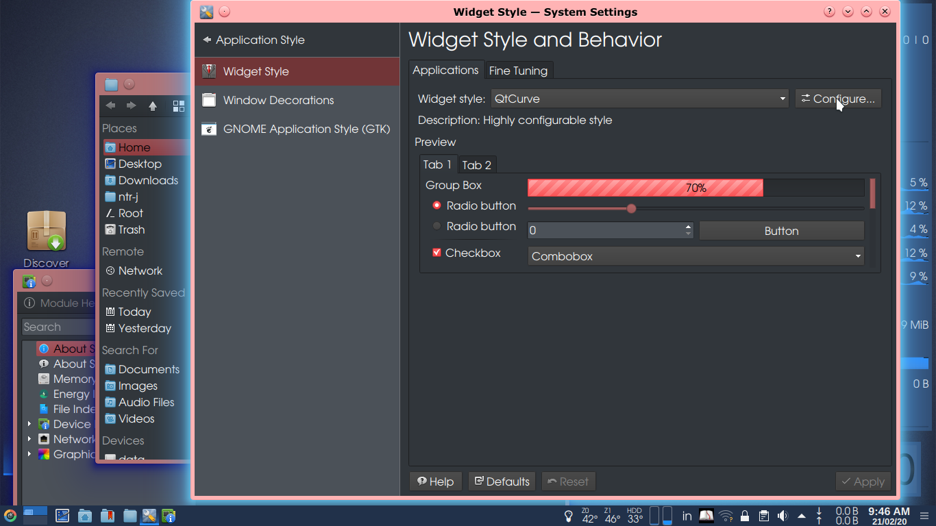
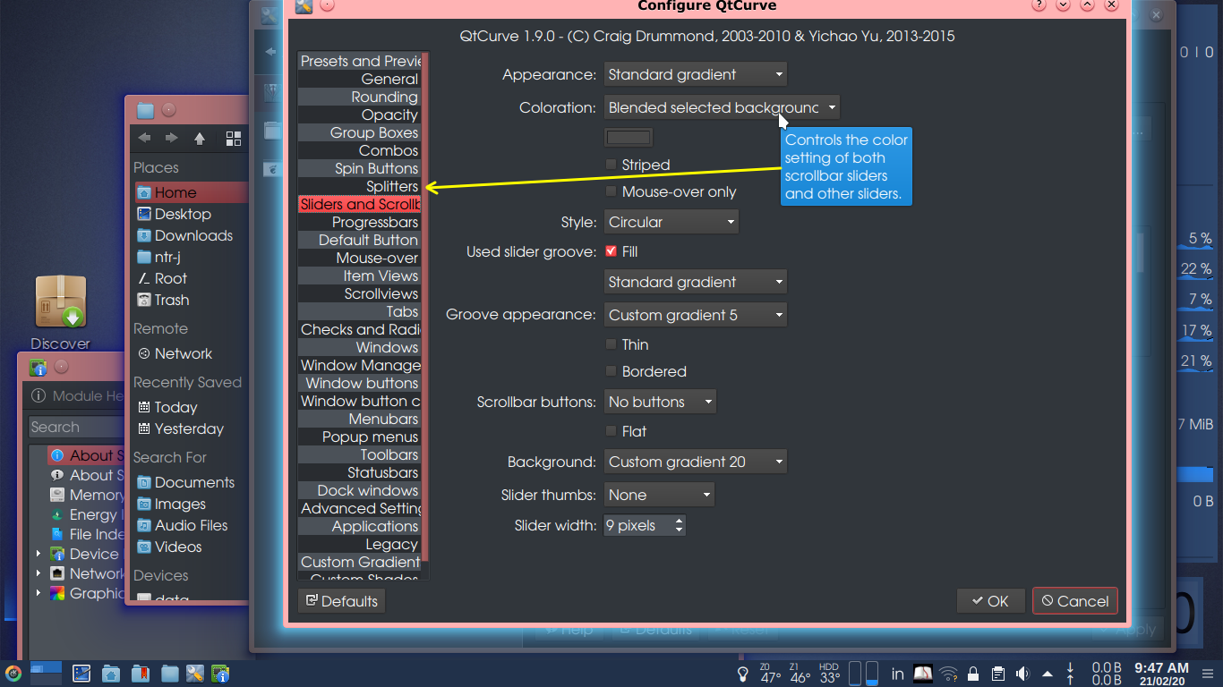
6) Other than breeze, the two application styles, fusion and ms windows, are present in iso , but they are not convenient. The scroll bar and progress bar is not clearly visible in them. ‘qtcurve’ is a feature rich application style (widget style) which is not in repo. (The screenshot is from Neptune 6 OS).
7) In breeze win deco, title bar height is decided by fonts as well as buttons, whichever is greater. So Keeping title bar fonts bold but of less size than other fonts help in reducing it’s height.
8) Regarding colors :- Active window must be easily distinguishable, so its title bar should have contrast color and inactive window title bar should of less saturated color than the active one. Translucency of inactive window to distinguish the active window is a trouble if one wants to compare 2 images keenly in two windows.
9) Selection color of higher contrast or saturation is especially necessary in Gwenview, because by default first image is selected in Gwenview and when you select some image by clicking '+' sign on it to delete, the first image also gets deleted. One must remember to deselect the first image by clicking in empty space or by clicking on '-' sign on it. So I never delete images from Gwenview but use Dolphin. When they are going to make Gwenview to behave like dolphin, I don't know. Distinctive selection color makes one aware of the 1st image under selection.
10) Cursor theme ‘Breez Snow’.
11) Not a must, but welcome is addition of dark blue-black desktop theme, I mean different from the black variants used in dolphin etc. system wide, so that the start menu and it’s sub menus will be easily separable from the background and other openapplications.
12) What are your thoughts on inclusion of ‘Krusader’ preferably or “mc” in the default installation? It is debatable/disputable as GUI application should not be started with elevated privileges, but what an average user should do?
Please save us from having a nightmare of dark theme over a dark background with dark windows of dark title bars and shadows covered by equally dark menu, nothing distinguishable from each other.
(Few configuration details I have mentioned in detail, not for you but, for the newcomers to make changes in their settings.)
Jag59 thanks for the well written ideas and examples, going to have a look at the all and deicide which I may use or tweak cannot promise any ETA but you have some good ideas in there 
- Edited
Late to the party but I really think Solus should stick to the default Breeze theme for KDE and the Adwaita theme for GNOME. Modifying themes can be aesthetically pleasing but the KDE team puts a lot of effort into Breeze from a usability, accessibility, and consistency perspective. Same thing with the GNOME team.
Each distro maintaining their own theme just leads to fragmentation and inconsistency. The GNOME devs have tried to convince distros to stop doing it: https://stopthemingmy.app/

Yeah, hard pass.

- Edited
jwinnie8 The GNOME devs have tried to convince distros to stop doing it: https://stopthemingmy.app/
They can "convince" all they want but I am going to continue to provide a cohesive user experience across both GTK and icon themes, something that cannot be accomplished using Adwaita for GTK theming and icons (since then you don't have a uniform design language for anything that isn't GNOME).. I couldn't care less about the opinions of a select few developers of GNOME applications.
4 days later
All I can say is that it looks pretty and works well. Just as lite as Solus MATE on my system.
[unknown]
this has nothing to do with default coloring etc. or the post subject, please stop posting in inside this post, if you need support create an seperate post.