Soutaisei I would try such a true black theme on the OLED screen 😃
The top panel's colors are nice and minimal 👍
Not sure if I like white windows borders tho, it reminds me about those high-contrast themes on Windows that I never tried 😃

Idea: maybe make header-bars a bit more colorful? 💡

    I've been away from Linux for a while but recently checked in on Solus and see a lot has changed around here : )

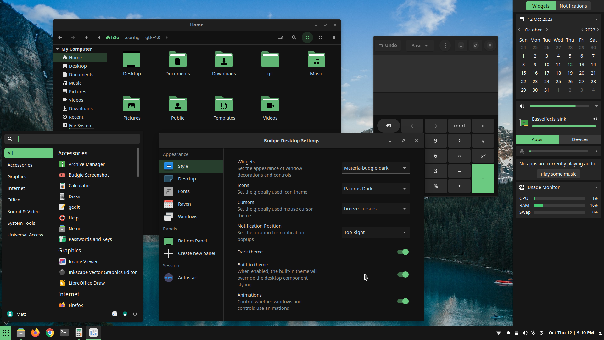
    Really digging the new built-in budgie theme. So much so that I had to try decking the rest of the theme out to match. Ergh, and I promised myself I wouldn't get caught up in tinkering around with things this time!

    If any Buddies of Budgie crew reading this, any chance you'll be updating other theme/folder components to match your new built-in 'green' theme? Or if migrating to EFL, this would all be moot?
      c2p

      nice work, how did you make your clock font bigger and bolder like that?

      • c2p replied to this.

        h3o the built-in theme will only style Budgie components; items like applets on the panel, Raven, etc. Maintaining a full theme is a lot of work, with many ever-moving targets. We simply don't have the time even if we wanted to. I'm glad you like the new colors, though!

        Solarmass

        All valid points and thank you!
        You kinda need some sort of window border on such full on black theme, otherwise you would get lost and confused finding where does your window end 🙂

        Headerbar (polybar) still needs a lot of work. And certainly planning to work in it to make it better. Initially thought of giving it a slight border color

          Soutaisei My idea is something like this:

          • not use 100% white color at all
          • maybe a slightly rounded external borders with width 3-10 times bigger, like this:

          • darker internal window separators, including close/minimize buttons
          • windows title-bars are filled with different (accent) color

            Solarmass windows title-bars are filled with different (accent) color

            That should make it easy to tell a dialog window from the main window it's displayed above. That's a problem I have with some dark themes -- I can't easily tell which window I'm working with.

            Staudey The xfce edition lends itself to proper customization

            Indeed it does. That looks almost like a Plasma desktop. And my Xfce VM is even a little smaller than my MATE VM.

            h3o Go to Budgie-Desktop-Settings -> Panel -> Clock -> custom format -> copy one of the codes from above and paste it in. You will see the effect.
            <span font_desc="Droid Sans 12"> %a %d %b </span> <span font_desc="Droid Sans 13" weight="Bold" >%H:%M</span>
            If you prefer AM/PM
            <span font_desc="Droid Sans 12"> %a %b %d </span> <span font_desc="Droid Sans 13" weight="Bold" >%I:%M %p</span>

            18 days later

            hype isn't the UI is too small on that I assume 4K display?

            • hype replied to this.

              Solarmass

              No it's the picture that make everything looks so small.

              24 days later