I use the Budgie panel on the left side and the font for the clock applet always appears far too small. On Budgie's implementation on other distros (Ubuntu Budgie, Arch, so on) the font appropriately "resizes" along with the rest of the desktop elements.
Solus Budgie Noto Sans 9:

Arch Budgie Noto Sans 9:

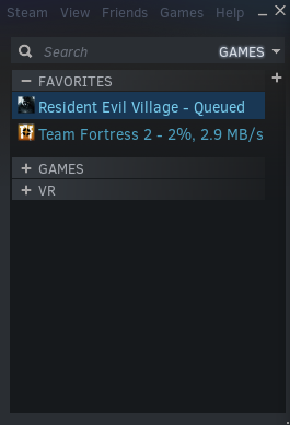
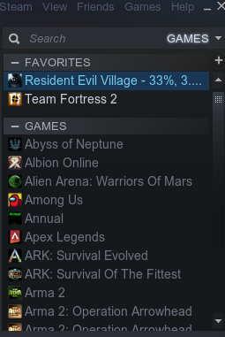
The font for the Steam library page on Solus is also always "bubbly", no matter what font I select or antialiasing/hinting option or whether LSI is enabled. For example:
Steam library on Solus Budgie Noto Sans 9:

Steam library on Arch Budgie Noto Sans 9:

I also notice strange issues (on vertical panel mode only) with the spaces between system tray and user indicator icons, and the placement of the date is uncentered when it is enabled with the Calendar applet. Everything looks fine and in its place in horizontal mode but I much prefer the workflow of a vertical panel.
I once saw a post about another user experiencing a similar issue, and they fixed it with a syntax/coding related format that worked or something like that. I couldn't figure it out and I've tried to find the post for reference but I can't seem to.
I also notice many elements don't properly line up in the panel, and the panel extends into fully maximized windows until I increase the icon size to exactly 53.
These are the only issues I experience on Solus. I can live with Steam looking a little goofy, but vertical mode feels cheap looking or "unfinished" and has many bugs, so I use the panel in default horizontal mode, but I hope to see it tidied up in the future!
PS an analog clock applet for Budgie would be so delightful