Good morning,
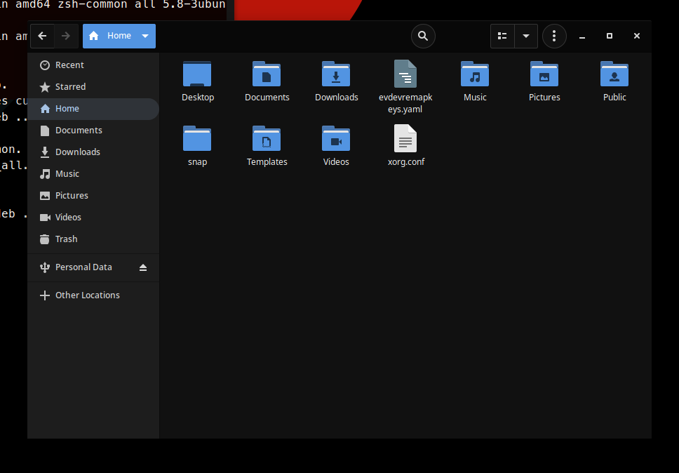
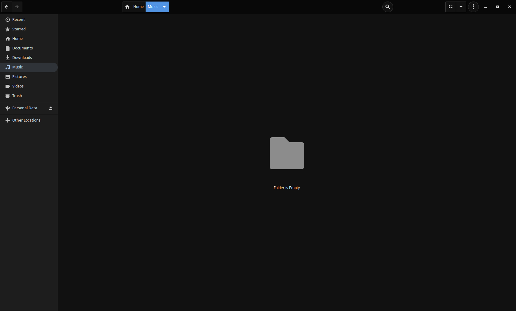
I just wanted to report a problem with the Files management. I didn't know whether to report it here, or the dev tracker for the budgie-desktop, but considering the Files software is from the GNOME stack, it may fit in these forums better. (But if you want me to remove it and put it in the correct channels, I'd be more than glad to do so, I'm still kinda new here, so I apologize). But for some reason, some elements don't look right. For instance, the search bar looks as if it has too much of an offset in windowed mode (and fullscreen). And in fullscreen, the problem is also seen in the little tab that marks your directory. I believe you may be able to spot the issue rather quickly from the screenshots posted.
Anyhow, thank you so much for your time and effort in creating this amazing operating system, it's the cloest thing to the "perfect OS" I've always envisioned.

